Share this article


Pantone's 2026 Color of the Year, Cloud Dancer, is the first soft white selected, reflecting a shift toward calm, clarity, and thoughtful restraint in design across interiors, architecture, and workplaces.
Great real estate design isn’t just about what we build. It’s about how a space makes us feel—and how subtly, yet powerfully, color helps shape that experience.
For 2026, Pantone has made a quietly radical choice: PANTONE 11-4201 Cloud Dancer. It’s the first time a white—or soft off-white—has been named Color of the Year.
Warm and airy, Cloud Dancer delivers light without glare, calm without coldness. It reflects a growing desire to tune out the noise, simplify our surroundings, and create breathing room—visually and mentally—in a world that rarely switches off.
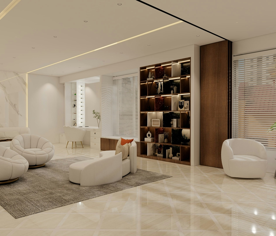
This isn’t a “blank” color. Cloud Dancer has presence. Rather than making a bold statement, it sets the right tone—bringing ease, openness, and clarity across interiors, architecture, fashion, products, and workplaces.
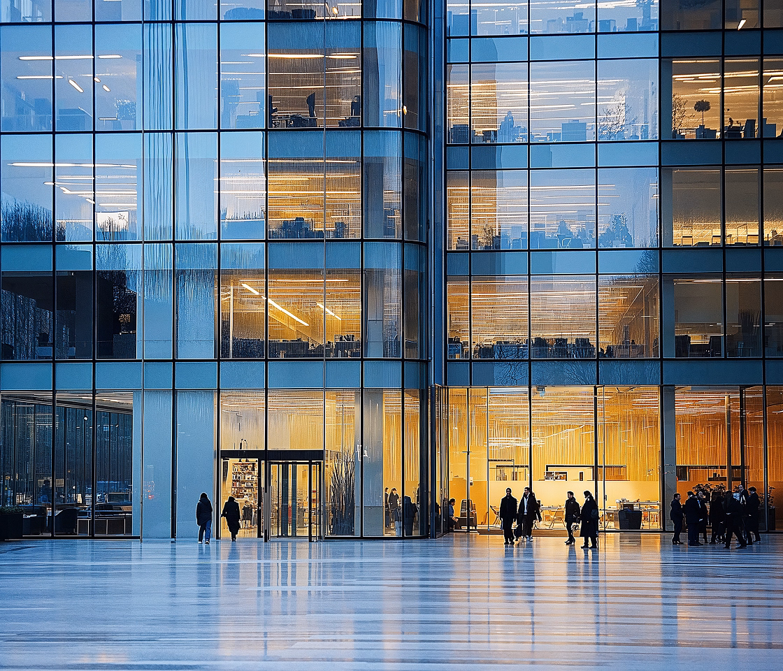
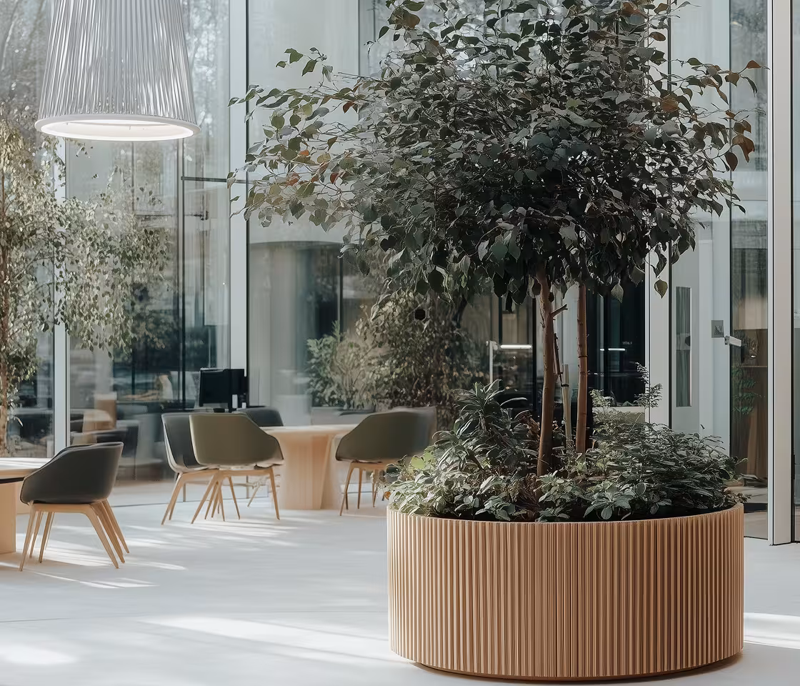
As a soft, refined neutral, it works effortlessly as a base layer, complementing everything from earthy palettes and bold accents to metallic finishes and creating cohesion. It enhances natural light and elevates materiality—wood feels warmer, stone appears richer, and textiles become more tactile—while in fashion and product design, it allows form, craftsmanship, and detail to take centre stage. What truly sets Cloud Dancer apart is its emotional adaptability: it can feel soothing in wellness spaces, sharp and focused in work environments, or timeless and elegant in hospitality and branding, making it far more than just a neutral—it’s a subtle yet powerful mood-setter.
Cloud Dancer isn’t about playing it safe—it’s about playing it smart. Its versatility allows it to shift seamlessly between moods, materials, and design styles. As Pantone’s influence continues to shape creative industries, one thing is clear: color today isn’t just something we see—it’s something we experience.
The rise of colors like Cloud Dancer signals a broader shift that color is no longer an afterthought, it’s a strategic design tool.
Both homes and commercial spaces are moving toward palettes that feel restorative and long-lasting. Soft whites support restorative, long-lasting spaces that reduce visual fatigue and adapt easily over time.
Architecturally, restrained tones help shift the focus to form, light, and spatial experience, supporting clean, modern design languages while remaining human, and approachable—especially the case in dense urban settings.
As offices become places for focus, collaboration, and well-being calm neutrals help reduce mental overload and create adaptable backdrops for collaboration, branding and evolving work styles.
In effect, the pantone color of the year, Cloud Dancer, reflects a move towards thoughtful restraint—a smart, adaptable approach that offers clarity, longevity, and endless design possibilities.